A Beginners Guide To Photoshop & Editing #2
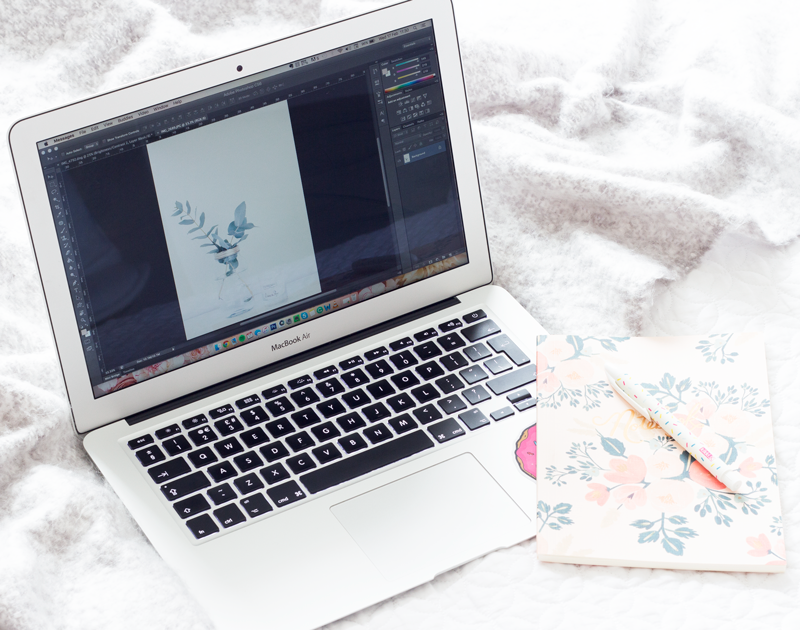
After putting together my first photoshop post a few weeks ago [read here], I decided to put a second round up together. In my first post I covered the basics but today I wanted to talk about a few more in-depth topics. It goes without saying that my editing techniques aren't perfect or the 'right' way to do things but here is how I get around more detailed issues and also add some fun additions to my images.
COLOUR & WHITE BALANCE
White balance: a camera setting that adjusts for lighting in order to make white objects appear white in photos. This is more difficult than it might seem due to the fact that light cast from different sources is different in color (technically called temperature). That is to say, light is rarely truly white in nature. The light from an incandescent or halogen bulb, for example, is red/orange in color, while that from the sun is relatively blue. A proper white balance setting in a camera will prevent, for example, a white bed sheet in a photo from appearing orange in color when it is being illuminated by a candle. [source]
Shooting on the appropriate white balance in camera is always the best way to go. It's a simple and easy process that requires no time at all but if you've forgotten to change it then you can alter it in the editing process. It can be found in the RAW photo editor in Photoshop.

auto [ORIGINAL IMAGE]

daylight

From switching from Auto to Daylight, you can see there is just a small difference in the general temperature of the image. Things are a little warmer and the greens of the plant are more vibrant. As I prefer to have a cooler tone to my images I use the colour temperature function to give my photographs a cooler feel.


If you want to go into a more in-depth process with colour balance and temperature you can go into the HSL toolbar. Which is what I've done here to add more of a blue tone to the image and enhance that green a little more. There is no set way to use this function and it all just takes time and practice.
REMOVING DUST
Whether it's dust or a small mark that you've missed when setting up an image it can be easily removed. It might seem like such a minor thing to edit out but it can make all the difference in the overall look of the photograph. In the image below you can see a few tiny dark marks which can easily be removed with the patch tool.


To remove the dust draw a small circle around it which will create a dashed shape, click on this and move it to the side where there is no dust. Here is a more cohesive guide to using the patch tool:
It's a great option for removing small unwanted elements to images but not too good for moving large items.
Whenever doing any sort of editing in the main body of Photoshop, you need to create a new layer. You do this by dragging your original background layer down the bottom where the new layer tool is. [See my first post for information about layers]. Then from the left-hand menu, click on the 'spot healing brush tool' and choose the patch tool function.


FINAL IMAGE

TEXT OVERLAY

Adding text to a photograph is relatively simple. You need to choose the 'Horizontal Text Tool' and drag a box to where you want to put the text. If you're a kid of the 90's or early 2000's it's not that different from PowerPoint.


When I add text to my images I love using the eyedropper tool to take a colour sample from the photograph and use it for the text colour. It's a really easy way to create a cohesive colour palette throughout the post.

If you're not a fan of harsh lettering then you can lower the opacity to create more of a brush like finish.

I hope this post was helpful!
R x
Check out: The Snug Blog, Madolyn Thinks and Mrs James Recommends, you can advertise with me here.